It Begins With A Conversation.
Frequently, nonprofits devoted to movement work focus most of their attention on development, organizing, coalition building, and networking, but codifying communications processes comes last! In our digital age, I work with organizations to develop their branding, strengthen and codify communications protocols, and refine digital and print content. We discuss where the organization currently exists and where it sees itself more fully engaging the community. Communications plays an essential role in fulfilling mission statements!

Branding and Content Development
S.O.U.L. Sisters Leadership Collective
S.O.U.L. Sisters Leadership Collective (SSLC) was a small and mighty nonprofit organization whose mission was focused on creating empowering leadership opportunities for Black and Brown girls and gender-nonconforming youth impacted by the justice system. The teams based in New York City and Miami disrupted cycles of violence by empowering youth who have experienced multitudes of criminalization using four pillars: collective leadership, radical artistic expression, healing, and restorative justice.


The problem
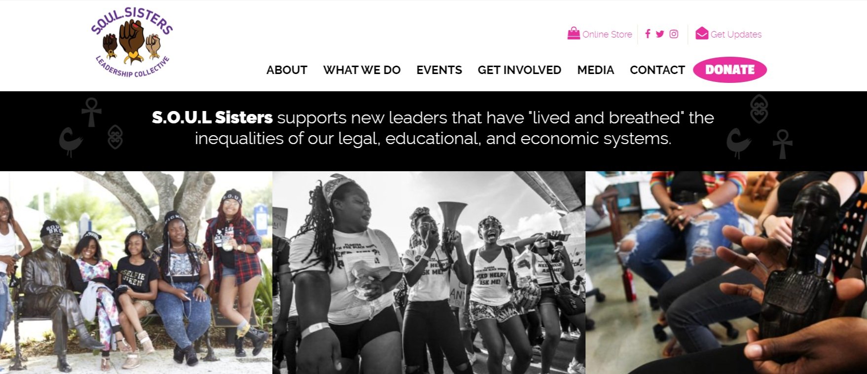
At the time, SSLC had no consistent branding throughout their materials, and the branding that did exist needed a refresh to be a more exciting version of grassroots community organizing. We discussed creating something that was more vivid, younger feeling, and a refinement of website copy. Instead of moving in a new direction, we wanted to keep the familiarity of what was started, remix it, and clean up what was started.
The solution
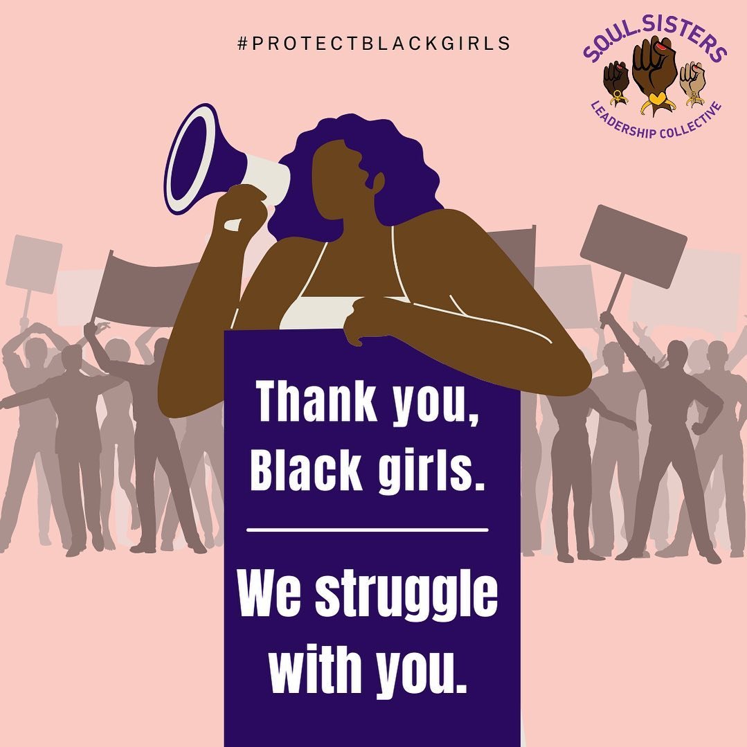
To do this on the fly, I focused on AB testing through social media! At the time we did not have the time to create focus groups and collect data independent of programming cycles. I utilized our social media and outreach materials developed for smaller programs to see ‘what stuck’ with the youth. I replicated those results to find our new voice.

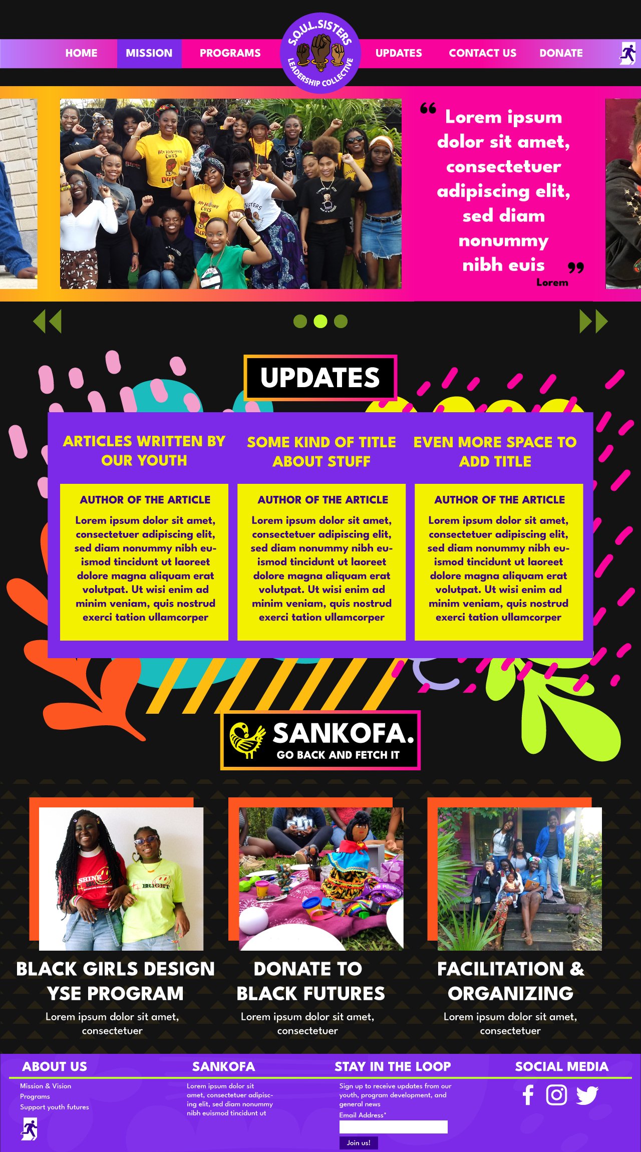
Logo Refresh

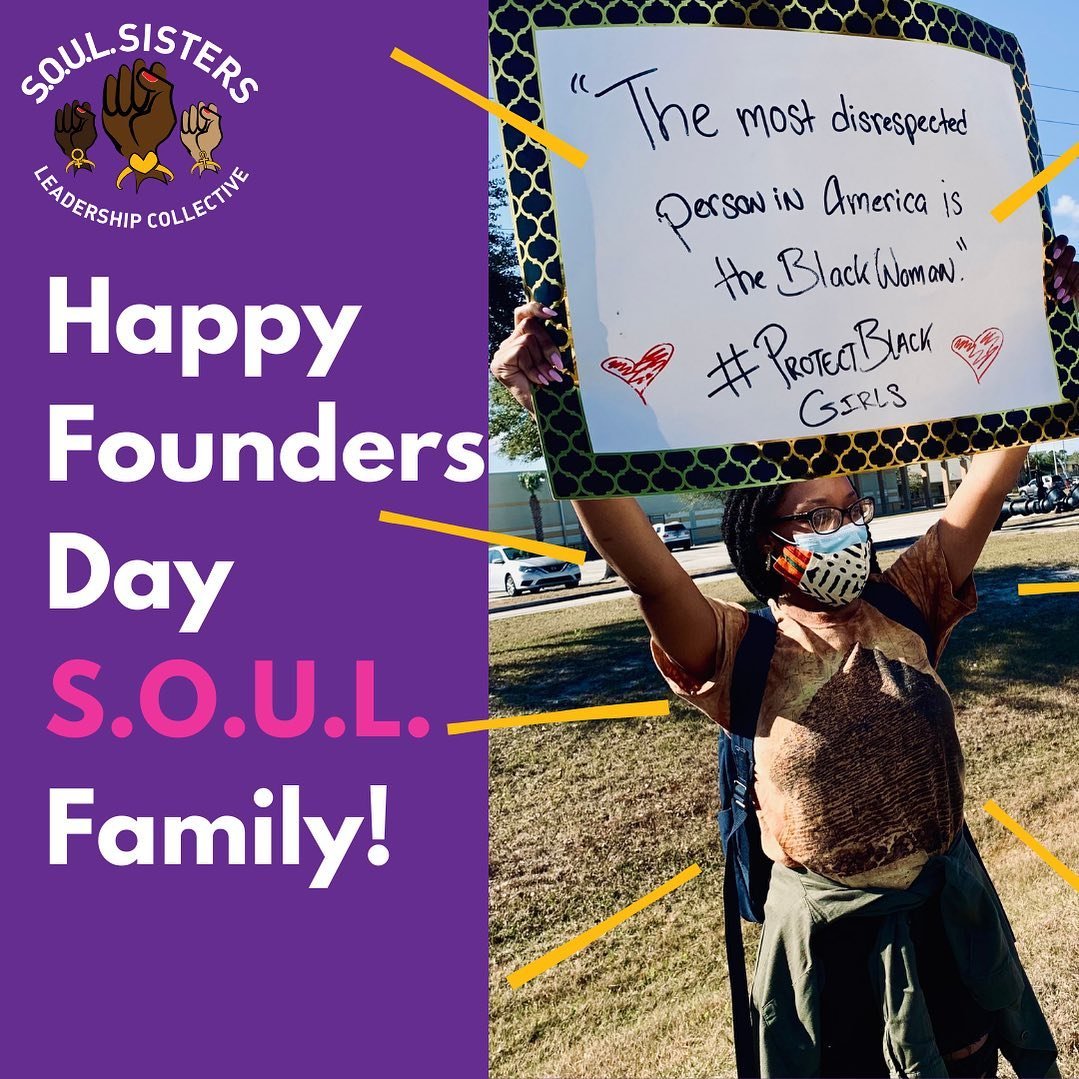
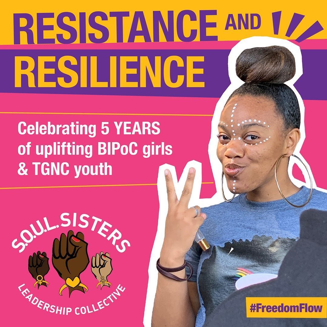
I first revamped the logo. Instead of the squished oval shape, I switched to a circle so that it would fit neatly in materials. I also redrew the illustration, took out the more gendered symbols, and changed the skintones to give the logo more of a polished, fun, inclusive design.
Stronger, bolder colors, adding in a solid background so that when placed over images, could still be easily seen
Wordmark logo refinement process
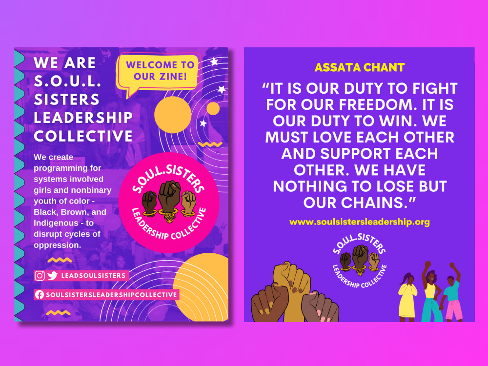
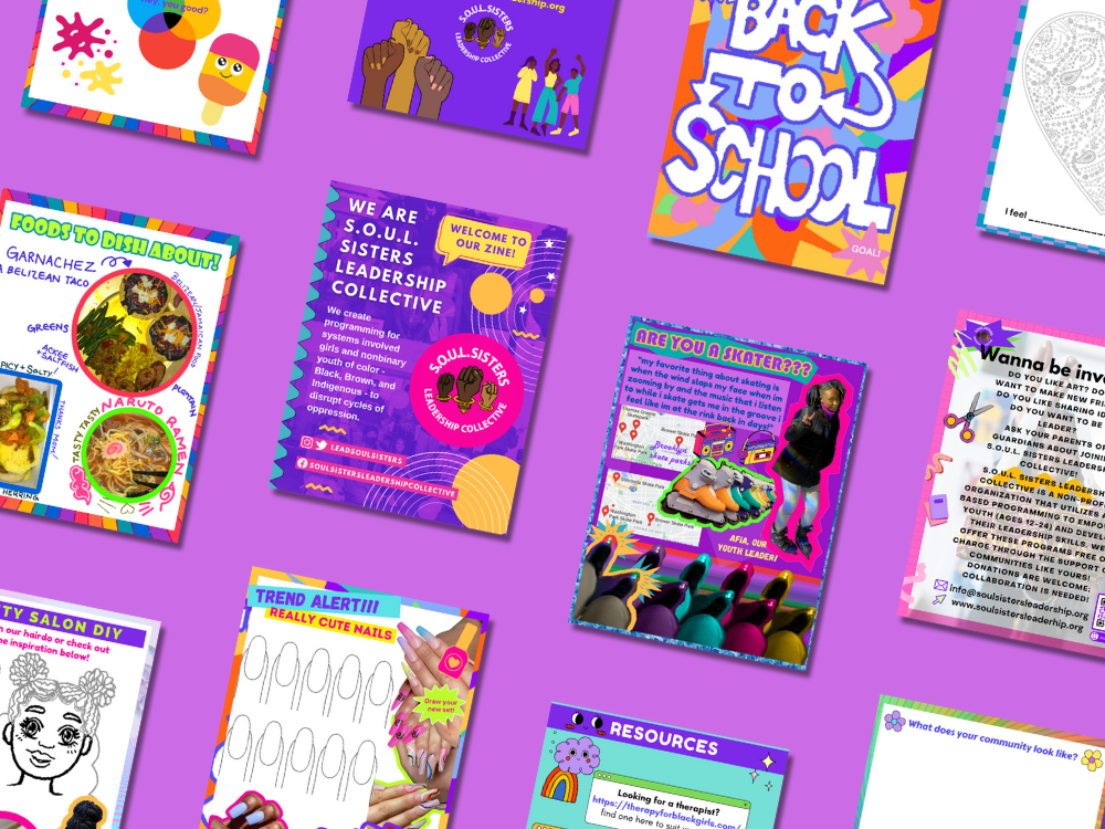

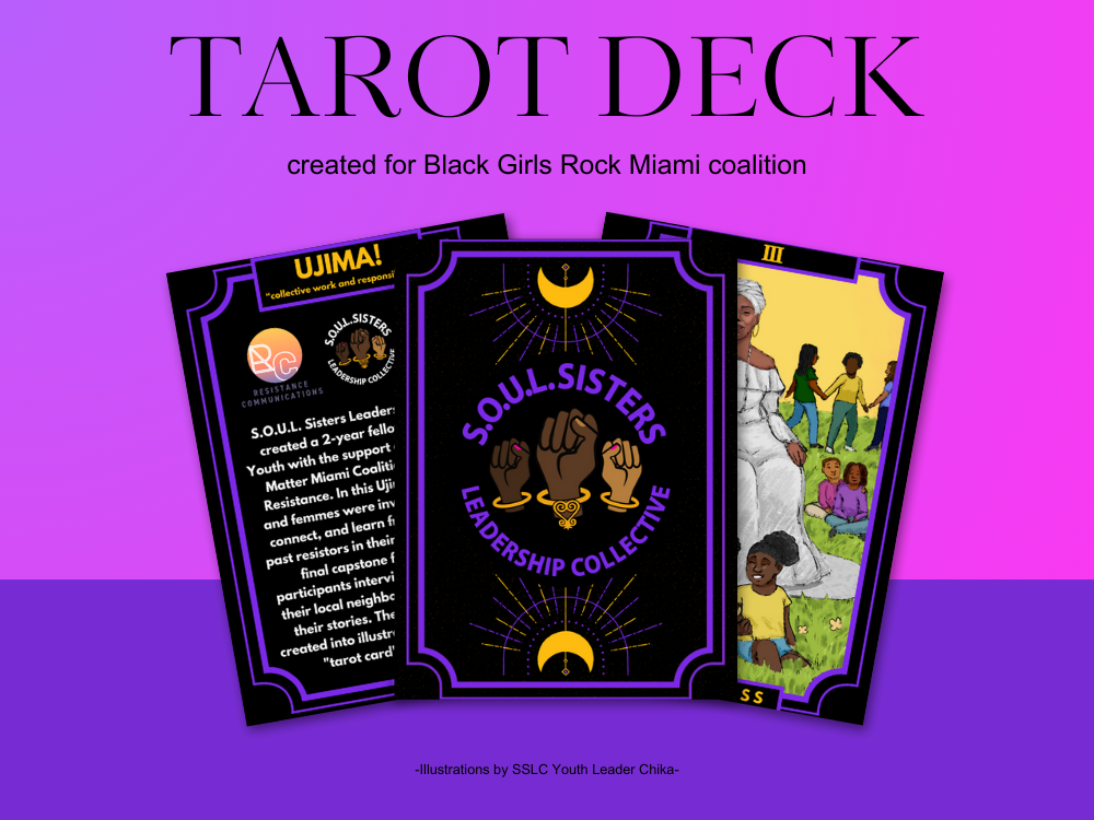

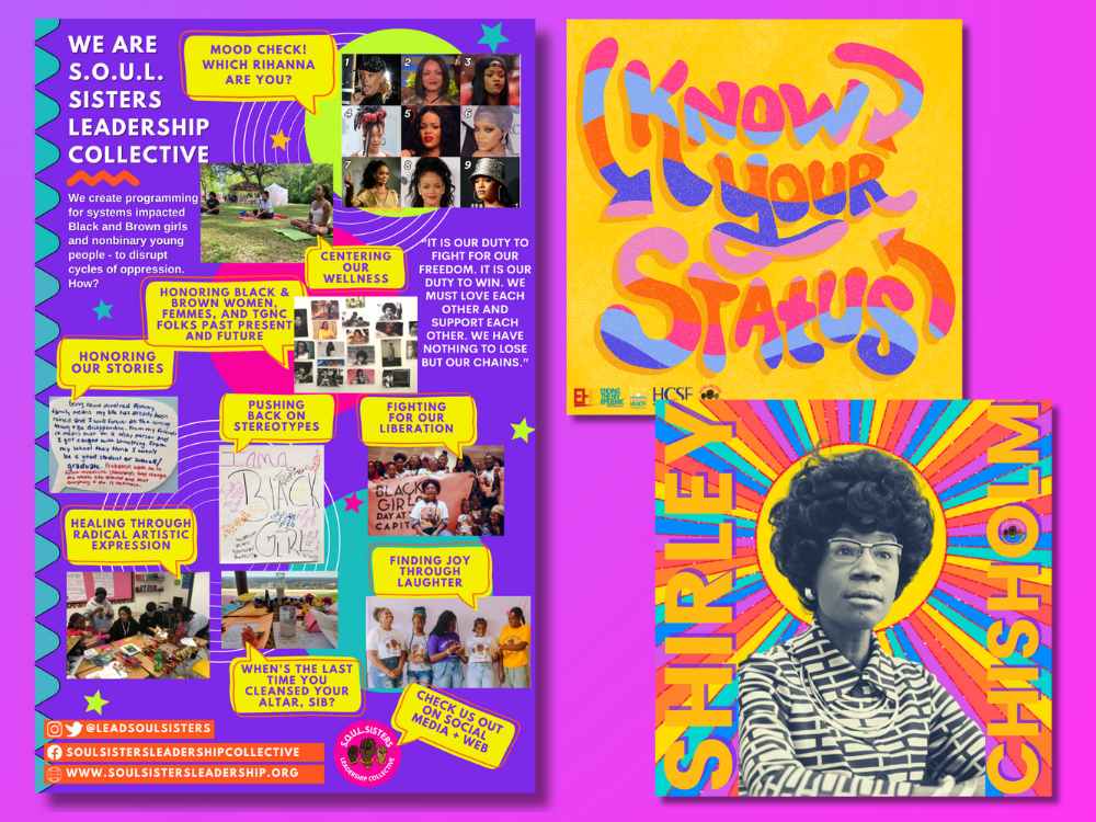
I created a branding and style guide suite to use in Canva for youth and staff, restyled our business cards, put new revamped logo t-shirts into production, created new digital education initiatives for Black August, retooled the social media feed to appeal to youth, and codified processes so that everyone on staff knew where to find materials and were empowered to create. This meant we had an established color palette, logos, and specific fonts to use consistently throughout our content.


The Results
With our new branding in place, I was able to increase our follow count by 30% and support fundraising efforts, raising over $250k through obtaining new programming sites and increased visibility to supporters interested in participating in our programming.
Communications is an essential part of organizational development and membership building! By taking the time to distill organizational culture into digital and print form, we are able to expand our reach, our support, and our community.